That 'Safe Neighborhood' You Picked? The Numbers Behind Your Decision Are Probably Wrong
That 'Safe Neighborhood' You Picked? The Numbers Behind Your Decision Are Probably Wrong
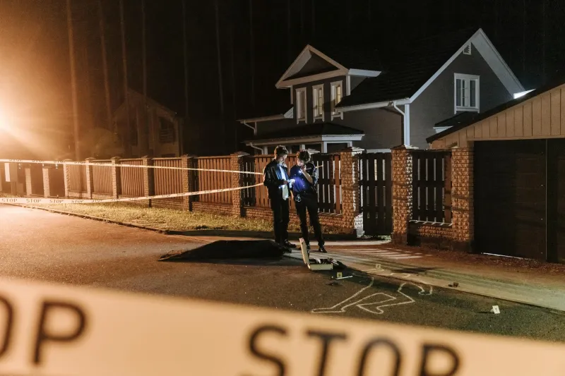
When Sarah Chen was house hunting in Phoenix last year, she did everything right. She checked crime maps, read school ratings, and even drove through potential neighborhoods at different times of day. The data all pointed to the same conclusion: Maple Ridge was clearly safer than downtown districts, with neat color-coded maps showing lower crime rates and higher property values. Six months after moving in, she discovered her 'safe' suburb had a domestic violence rate nearly double the city average — something that never showed up in any of her research.
Sarah's experience reveals a troubling truth: the safety data we rely on to make one of life's biggest decisions is far more misleading than most Americans realize.
The Myth We All Believe
Most of us approach neighborhood safety like it's a simple math problem. Lower crime numbers equal safer streets, right? We pull up apps like NeighborhoodScout or SpotCrime, see those comforting green zones, and feel confident we're making data-driven decisions. Real estate agents reinforce this by highlighting low crime statistics, and mortgage lenders even adjust rates based on neighborhood risk assessments.
This approach feels logical and scientific. After all, we have more data about crime than ever before, with detailed maps showing exactly where incidents occurred and sophisticated algorithms ranking neighborhoods by safety scores.
What's Actually Happening
But here's where it gets complicated: crime statistics are collected and reported so inconsistently across American cities that comparing neighborhoods often means comparing apples to submarines.
Consider how different police departments handle the same incident. A break-in in affluent Westfield might be recorded as "burglary," while the identical crime in working-class Eastside gets logged as "breaking and entering." Some departments count domestic disputes only when arrests are made, while others record every call. Traffic stops in certain areas might be classified as "suspicious activity," inflating overall crime numbers in ways that have nothing to do with actual danger to residents.
Even more problematic is what doesn't get reported at all. Wealthy neighborhoods often have private security that handles incidents internally, keeping them out of public crime databases entirely. Meanwhile, areas with higher police presence naturally generate more reported crimes — not because they're more dangerous, but because there are more officers around to witness and document incidents.
The Perception Problem
Research from the University of Chicago reveals something even more unsettling: our perception of neighborhood safety correlates more strongly with demographic composition than actual crime rates. Neighborhoods with higher percentages of Black and Latino residents are consistently rated as "less safe" by homebuyers, even when their crime statistics are identical to or better than predominantly white areas.
This bias shows up in real estate platforms too. Zillow's "walkability" scores and safety ratings tend to favor neighborhoods with certain demographic profiles, regardless of actual pedestrian accident rates or crime data. The algorithms aren't intentionally racist, but they're trained on historical data that reflects decades of discriminatory housing practices and biased policing.
Why the Numbers Don't Add Up
Part of the problem lies in how we define "crime" in the first place. Most safety apps focus heavily on property crimes like theft and vandalism, which are highly visible but rarely pose physical danger to residents. Meanwhile, they often underweight or misrepresent more serious threats like domestic violence, drunk driving, or corporate environmental violations that can have much greater impact on family safety.
Take drunk driving statistics. Suburban areas with lots of restaurants and bars often have significantly higher rates of alcohol-related incidents, but these don't show up prominently in neighborhood safety scores. Instead, we see break-ins and car thefts flagged as major concerns, even though you're statistically more likely to be injured by an impaired driver than a burglar.
The Historical Bias Built Into 'Safety'
Many of today's "safest" neighborhoods according to popular real estate platforms were literally designed to exclude certain populations through discriminatory zoning laws and restrictive covenants. These areas developed lower reported crime rates not because they were inherently safer, but because they had fewer residents and more resources for private security.
Meanwhile, neighborhoods that were historically redlined and denied investment still carry the statistical baggage of decades of disinvestment, even as they've undergone significant improvements. A formerly industrial area that's been transformed into a thriving arts district might still show high historical crime averages that don't reflect current reality.
What This Means for Your Next Move
This doesn't mean neighborhood safety research is worthless — it means we need to get smarter about what questions we're asking and what data actually matters.
Instead of relying solely on crime aggregation apps, try visiting local community meetings, talking to longtime residents, and looking at trends over time rather than snapshot statistics. Pay attention to infrastructure investments, new business development, and community engagement levels, which are often better predictors of neighborhood trajectory than historical crime data.
Most importantly, recognize that "safety" is personal and contextual. A neighborhood with higher property crime might still be the right choice for your family if it offers better schools, shorter commutes, or stronger community connections.
The Bottom Line
The next time you're evaluating a potential neighborhood, remember that those clean, color-coded safety maps are telling you a story — but it might not be the story you think you're hearing. The real safety picture is messier, more nuanced, and more influenced by historical bias than most homebuyers realize.
The goal isn't to ignore safety concerns, but to understand what the data actually represents and what it leaves out. Sometimes the "dangerous" neighborhood with great schools and community investment is a better long-term bet than the "safe" suburb with hidden problems that never make it into the statistics.